5 ways UX impacts SEO and Organic Traffic
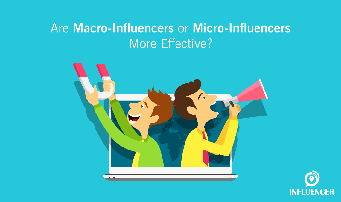
There is no doubt that influencer marketing is the go-to form of marketing in 2018. However, whether you are trying to get your first 1000 YouTube subscribers or trying your hand on regional content, it all narrows down to one simple step – ranking on Google. In order to yield better search rankings and drive organic traffic, it is important to back your website with a great user experience design to make it easy to use and enhance customer satisfaction. It allows you to see from a follower’s perspective and deliver exactly what they are expecting. Think of it as customer service at a restaurant. You would want your food to arrive quickly, look appetising and be easy to consume. That is exactly what UX is all about but for websites. Let’s take a look at how UX and SEO can be used as a winning formula to drive organic traffic to your website and, in turn, help you rank on the leading search engines.
Site Speed
A quick response time is one of the important cornerstones of any website. If this one takes a hit, the whole structure could fall apart. Research indicates that 18% of mobile users leave a website if the page does not load within 5 seconds and a whopping 30% leave when the time to load touches 10 seconds. As you can see, there is a close relationship between the two variables here, and it can only mean one thing- that your followers are not happy with the website because of its lack of speed and are more likely to never visit the page again. This high bounce rate will have a huge negative impact on the percentage of conversions. Now you may wonder – what does this have to do with Search Engine Optimisation? SEO is not just about using the right create content that converts to rank better. In 2010, Google announced that the speed of your website is directly proportional to your rankings, giving you all the more fodder to pay attention to your loading time.
Design
Imagine a basic website with a dull design and obscure text – would you enjoy scrolling through their content? Nobody would. Boost the look and feel of your website and attract more followers with a more sophisticated outlook and a contemporary design to drive more traffic to it. A website that looks outdated may appear like it has not been updated in a long time, which, in turn, will lead to poor ranking. Read on for a few points to keep in mind in order to improve user experience through design.
- Keep the whole setup simple. The icons used on the website should be easy to understand.
- Make the search bar the focal point of your website. It helps the user to land on what they are looking for directly.
- Avoid overcrowding the page with too many animations, promotional ads or infographics. It will steal focus from the main content.
- Simple aspects like unnecessary pop-ups or autoplay with sound could also throw the user off.
A good website design will ensure that Google crawls through the content efficiently for ranking purposes and a potential follower discovers exactly what they are looking for. In the end, it’s a win-win for all.
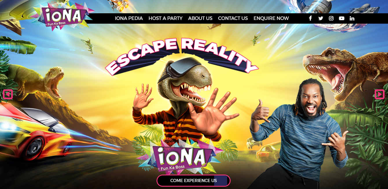
Featured above is the homepage of iONA – a gaming arena. The design of the website is simple yet vibrant and energetic, resonating what the brand stands for.
Clear navigation path
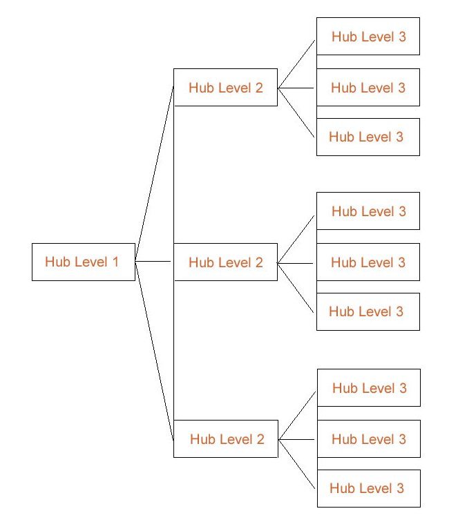
Let’s say you’re inviting a friend over to your place and you’re poor at giving directions. What is the likelihood of the friend reaching the correct destination? There is a half in half chance in that. It’s the same thing with your website. You have invited a user to your page, but without a clear set of directions, the user may stay or decide to leave the site. Any sensible marketer would not gamble with these indefinite outcomes. With optimised site navigation, you can create clear paths to all the underlying pages of your website, which will lead to higher customer satisfaction, increase in traffic and a bigger chance to rank better.
Courtesy: SEOinc
However, every webpage is different in character and does not have to adhere to the same standard format. Depending on the size of content that goes on the page, the navigation path can be developed subsequently. Here are a few best practices regarding the navigation design:
- If your page has long, unending content, employ a stick navigation path which enables the user to jump to the top with a single click.
- Any particular order of classification is preferred over random listings (like alphabetical, new to old, popular to less popular, to name a few)
- Users like to be reminded of their search history. This has proved to be much easier for people to backtrack as opposed to clicking ‘Back’ several times.
- Linking the logo to the homepage will let the user reach base zero instantly at his will.
- The bread-crumb trail is a great navigation setup if your website has a lot of pages. It aids the user in locating himself on the website and in retracing his steps back to the original page
Mobile Optimisation
In today’s millennial age, mobile has become our go-to gadget for almost anything and everything. Google has reported that more than 50 percent of website searches are performed on mobile than on a desktop. Google has also clearly mentioned in their Hummingbird update that any website that is not usable on a hand device will suffer in its search rankings. With half the traffic coming from mobile searches, we can’t emphasise enough on the significance of mobile optimisation. Here are a few ways to help you achieve that:
- It’s essential to keep in mind that mobile users do not use high precision-pointing mouses. Therefore the design should be light on the clumsy fingers. The interactive button sizes should be bigger and easily clickable.
- Since mobile screens are comparatively smaller in size, the site should adapt itself in a way that its texts are readable without having to zoom in each time and that’s why creative fluid layouts are here to save the day! They readjust according to the screen size without hampering the pixel quality.
- The website should enable AMP (Accelerated Mobile Pages) framework as it lets the user access the blogs or articles without having to wait for the site to load.
Optimising your website with Accelerated Mobile Pages (AMP) is a great way to increase your site speed with higher performance and guaranteed engagement. This plugin works exclusively on mobile pages. Since more than half of the Internet users around the globe access the web through mobile, leveraging the power of AMP is mandatory to get your brand noticed.
Pages that are optimised with AMP will appear with a lightning symbol in your search results. This plugin is usually used on content-heavy pages, like blogs, to reduce the time taken to load.
Relevant and engaging content
If your question is ‘How can I make my visitors keep coming back to my site and not just drop by once? The answer to it would be top-notch content. It is vital to create content that converts. Let’s say you’ve impressed your viewer by conforming to all the above strategies- your site speed is ideal, your design is full of life and user-friendly, the navigation path is crystal clear, but the site has irrelevant content. The user, without a doubt, would immediately leave the page and head to a better one. So make sure your homepage displays an outline of what’s on the site. It will help both Google, and the viewer, get an idea of what the page is all about. Over-usage of jargons should be avoided because reaching out for a dictionary every time you stumble upon a new word could get annoying.
With all that said, UX can also be a bit tricky to get it right initially, but in the end, it will be worth the effort you’ve put in. A good user experience will definitely go a long way in influencer marketing and ensure that your site ranks high with heavy traffic and a guaranteed increase in customer satisfaction. You can also check the 15 content marketing blogs every blogger must follow for closer insights.


Trending


Related Posts